

...we wanted to create a website design that would be synergistic with this, to maintain a consistent brand image. This would make our band's image more recognisable, so our chosen font and colour scheme would link with the band in our audience's mind.
This was our original home page design:

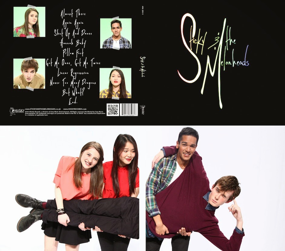
To fit with the rainbow-on-black theme, we decided to have a black (technically very dark grey) background with different coloured borders around photographs of the band (and the CD). These pictures are links to the different pages labelled on the sticky tape.
Our band's name is Sticky & the Melonheads, so we designed our pictures to look like they are stuck on the page with sticky tape. This provides a visual link to the band themselves and could be a recurring feature of our website and digipak.
We kept this theme consistent throughout our website, keeping the same dark background throughout and using the coloured borders around images, for example, on the gallery page:

To provide variation, once you click on each section of the gallery (e.g. behind the scenes, the band), the images are displayed in a style called "accordion":

When you click on the "accordion", it then allows you to see the pictures in full, like this:

Displaying the images in the gallery this way provides an interesting and original alternative to the coloured borders around images on the other pages.
While we liked our home page aesthetically, in terms of functionality, we realised later that it needed improving because no actual information about the band or events is given to the audience immediately. It was important to change this because informing the audience about the artist is one of the most important features of an artist's website, and audiences want to gain information on a website as easily and quickly as possible.
We decided to keep the layout and design of our home page the same but we changed the text on the links to be on the pictures themselves, rather than on the sticky tape, and in the same font as the album cover. Using this same font keeps this as a consistent part of our brand image and also the links are easier to read because it is bigger.
We put news events on the front page, such as the HMV signing pictured below, and the "Shut Up and Dance Tour". Also instead of "store" on the picture of the CD, we simply wrote "Out Now" to more effectively advertise our product, as making profit is another key feature of a website.
 |
| The new home page |
We also added a live feed with the band's latest tweets, Facebook statuses and instagram posts that you can scroll through. This increases interactivity and connects the audience with the band. It is also an instant and immediate way to promote the artist on their website and connects the website effectively with their social media accounts.


No comments:
Post a Comment