Our Website

Our Digipak Cover
Saturday, 24 January 2015
Saturday, 3 January 2015
1. In what ways does your media product use, develop or challenge forms and conventions of real media products?
To make our music video, digipak and website we researched real examples of these to understand their forms and conventions, which we could use, develop or challenge - for example, San Cisco's Awkward music video and The 1975's website, both examples specific to our chosen genre, indie pop.
THE MUSIC VIDEO
 |
| Band performance |
 |
| Dance sequence |
McFly, "Love is on the Radio"
The 1975, "Girls"
Both of the above examples consist of entirely studio-based performance, like our music video.
One convention of studio-based performance videos is a range of set-ups with different props and costumes used, demonstrated in both Girls and Love is on the Radio. This makes the music video more interesting and varied visually.
 |
| McFly - Love is on the Radio |
 |
| Our music video |
 |
As well as to make our video more interesting, we used different set-ups to present our theme of different eras and to illustrate the meaning of the song. As Goodwin (1992) identifies, in music videos there is often a relationship between the lyrics and visuals and this applies to our video. The lyrics state that the couple is "bound to be together", and that she is "his destiny". The different set-ups demonstrate the idea that the couple could have ended up together in similar situations in any circumstance or time period, and that love is a universal, eternally relevant concept.
The music videos for Girls and Love is on the Radio also suggest that a convention of studio/performance-based videos specifically is a lack of camera movement. While not every performance-based video follows this, as it is actually a typical convention of a music video to have camera movement...


 "Thinking Out Loud" (Ed Sheeran), "Honest" (Kodaline), "All About That Bass" (Meghan Trainor)
Carol Vernallis (2001) identified camera movement as a convention of music videos
...we decided that we should, because the lack of camera movement is made up for in set design, choreography and a variation of shot types.Carol Vernallis (2001) identified camera movement as a convention of music videos
Band performance itself is a common convention of music videos, and the indie genre specifically. The video for "Honest" by Kodaline demonstrates how this is often done, with a variation of shot types that present all band members both as a group and individually:

 |
| As with Kodaline's example above, our band performance includes a WS of the whole band, and mid-shots and MCUs of all the band members |
The wide shot of the entire band is used frequently throughout the video to establish the band's identity, and close-ups are also used frequently so the audience can become familiar with the band members as individuals, too. Carol Vernallis identified this as a common convention of music videos.
 |
| The demands of the record label would include the need for close-ups of the artist such as this ECU of Jacob - Andrew Goodwin identified these as "visual hooks", "beauty shots" or "money shots" |
 |
| CUs of instruments could appeal to indie fans who love music |
We develop the convention of performance-based videos because the performance tells a story. This is also done in San Cisco's Awkward. Their performance creates a narrative:


Another feature identified by Goodwin is the inclusion of intertextual references. These are a very significant part of our video. The eras that we chose are most easily identifiable by the pop culture references of the time. We included references to films and TV shows made or set in our eras, reflected in the set design, costumes and choreography:


Our pop culture references could potentially appeal to both our target audience and people outside it - anyone who could recognise what we are referencing.
THE DIGIPAK
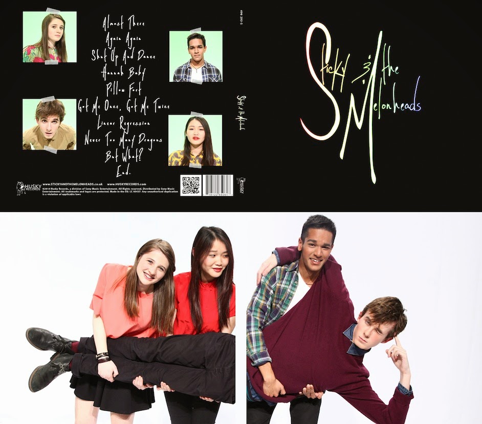
For the digipak, we largely followed the forms and conventions of existing album art but we developed these too to create an image unique to Sticky and the Melonheads.
The front cover is minimalistic, with a black background and the band's logo in the centre:


 The reason this is a common convention of indie artists specifically could be because the image indie artists often want to present is that their music is more important than their image. By having minimalistic album covers without a photograph of them on the front cover, they can give the impression that they are an artist with "real" music because their image is not important to them (even if, really, it is an image in itself that they value). We did develop this with our back and inside covers, including photographs of the band members. This was to establish their lighthearted indie pop identity.
 As a debut artist we also felt it was important for audiences to get to know what our band look like as well as sound like. This way the audience are more likely to remember their image.
There are mixed gender indie bands, San Cisco and Daughter being two examples:
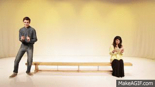
The band members are lip-syncing while acting...
...just as Jacob does in our video:
Goodwin identifies other conventions of music videos that apply to our video:
We also illustrated some specific lyrics in the song:
 |
| He sings "The chemical, physical..." - they make physical contact, chemistry between them |
 |
| He sings "She took my arm" - they hold hands |

Grease - 50s intertextual reference

Saturday Night Fever - 70s intertextual reference
Velvet Goldmine - 70s intertextual reference (costume)

The Breakfast Club - 80s intertextual reference

Rick Astley "Never Gonna Give You Up" - 80s intertextual reference
Friends - Central Perk logo on mug - 90s intertextual reference
Most of our secondary audience, 16-25 year olds, would recognise this
THE DIGIPAK
For the digipak, we largely followed the forms and conventions of existing album art but we developed these too to create an image unique to Sticky and the Melonheads.
The front cover is minimalistic, with a black background and the band's logo in the centre:
This is similar to the album art of real indie bands:
The 1975, Franz Ferdinand and The xx album covers
While The 1975 album cover is not just the band logo, this is a dominant feature and we were influenced by its simplicity
The reason this is a common convention of indie artists specifically could be because the image indie artists often want to present is that their music is more important than their image. By having minimalistic album covers without a photograph of them on the front cover, they can give the impression that they are an artist with "real" music because their image is not important to them (even if, really, it is an image in itself that they value). We did develop this with our back and inside covers, including photographs of the band members. This was to establish their lighthearted indie pop identity. As a debut artist we also felt it was important for audiences to get to know what our band look like as well as sound like. This way the audience are more likely to remember their image.
Having pictures of the artist on the inside cover but not on the front is a convention demonstrated by the band Arctic Monkeys with their "AM" digipak:
 |
| AM front cover |
 |
| AM inside cover - photograph of the band |
THE WEBSITE
Artists' websites are designed to provide audiences with information about the artist, and present them with opportunities for purchasing and interactivity. They also work stylistically to establish an artist's image. This is what we tried to create with our website.
These different parts of the website are all easily accessed via the navigation bar. Websites typically include a navigation bar at the top of the website with the header:
| The 1975 |
| Imagine Dragons |
 |
| Kodaline |
 |
| 5 Seconds of Summer |
 |
| OUR HEADER AND NAVIGATION BAR We also included a moving banner to promote the artist - the music video, album, competition and tour. These pages can be accessed instantly by clicking on the banner. |
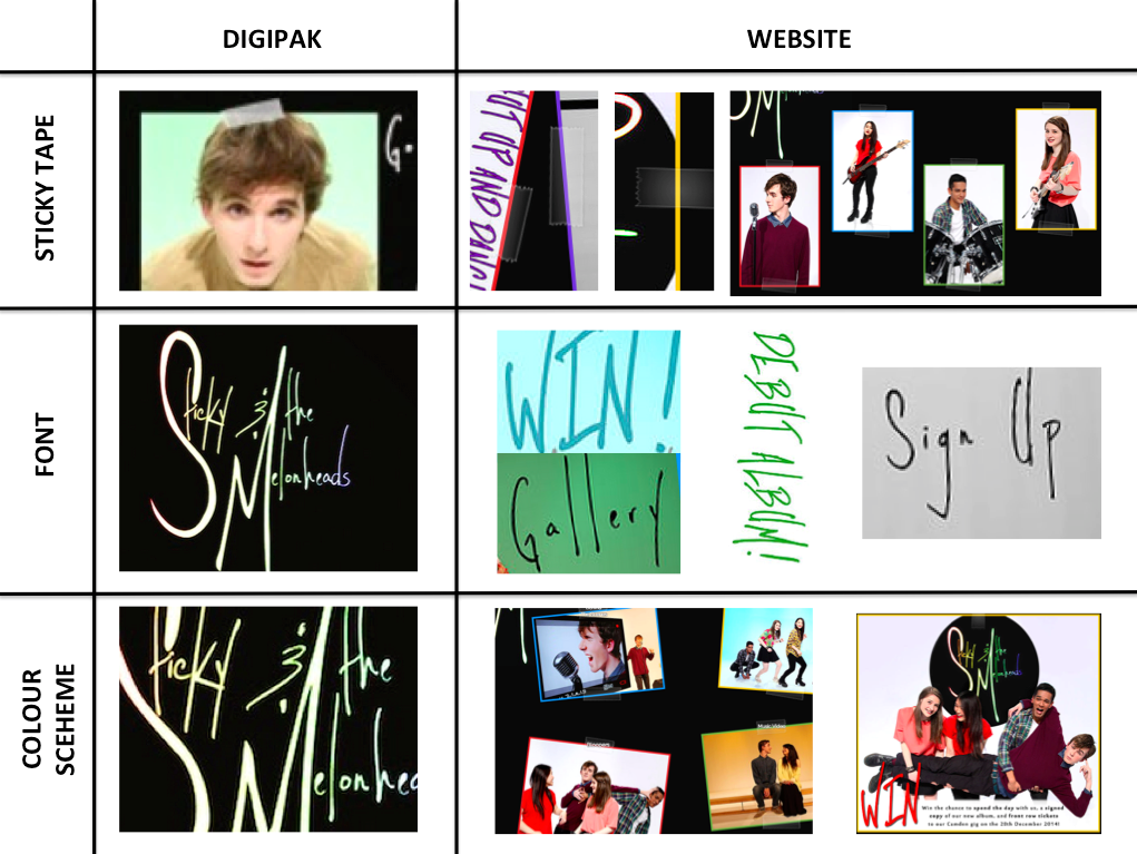
The navigation bar helps improve the website's ease of use as every page can be accessed instantly from any other page of the website, and is clearly visible so it helps audiences to find what they are looking for easily. Like the examples shown, we display our artist's logo on every page next to the header so their brand identity is firmly established and is promoted across the website. We also branded our artist by keeping a consistent font, style (coloured borders around boxes, sticky tape) and colour scheme (black and rainbow) across the website.
Influenced by existing websites like the examples included, we tried to create a site that allows our audience to find out information about the artist, make purchases and interact with the band.
...
In relation to the artist as a whole, arguably we challenged the common conventions of indie bands in terms of representation, significantly gender. Indie bands are dominated by all male groups:
 |
| Examples of all-male indie bands (rock and pop) Arctic Monkeys; Alt-J; The 1975; Fun.; Kodaline; Foster the People; Passion Pit |


 However even these are male-dominated, and we challenge this norm by having an equal number of male and female band members. This demonstrates that the indie market doesn't have to be male-dominated, and offers something different to fans of the genre. In addition it would appeal to female indie fans who might want to see more of their own gender in the genre they listen to.
Overall we used the forms and conventions of music videos, digipaks and websites across our three media products, influenced particularly by examples within our genre, and developed these to create a unique brand image for our artist.
Saturday, 27 December 2014
2. How effective is the combination of your main product and ancilliary texts?
We hoped to create a music video that would work synergistically with our website and digipak. As Richard Dyer states, an artist is a product of a record company and needs to be packaged and sold to audiences, and we tried to do this by creating a cross-platform promotional campaign that would link the products together and establish a recognisable brand identity for our artist.


The coloured lighting helps the audience to differentiate between the set-ups but the colours used across all three products help to construct our artist's image as a lighthearted, upbeat indie pop band.
In addition to creating a brand identity for our artist, our main and ancilliary texts work together to promote each other as well as the artist in general. For example:


On the back cover of the digipak at the bottom we also promote our website:
 This means that people with the album know where to go for more information about the artist.
We also created synergy with the band's costumes:
This means that the publicity shots on the website work to promote the music video, because the band are dressed in the same outfits. The costumes link all three products together.
The characters and personalities of the band members are also consistent across the three texts. In the music video the performance is quite fun and the band don't take themselves too seriously, especially in the era scenes:

They still have moments of appearing more serious and "cool" in their performance:
We wanted our two ancilliary texts to work together, too, to effectively brand our artist in ways that a music video can't, e.g. with the font used. The table below briefly illustrates some examples of how our digipak and website work in synergy stylistically:


Richard Dyer makes the point that an artist's identity is not just restricted to their music and The 1975 demonstrate this: the image constructed in their music videos extends into their album cover and website. All these products, music video included, follow the same black-and-white colour scheme to establish The 1975's 'cool', indie-rock image.


Similar to The 1975, the lighting used in our music video matches the colours used for our logo on the album cover, and on the website:
- The sticky tape appears on the back cover of the digipak and frequently on the website. As well as tying these two products together, it links to the name of the band: Sticky and the Melonheads, so this image becomes associated with the band.
- The rainbow colours used for the logo on the album cover match the coloured borders and fonts used consistently on the website. The black backgrounds also match.
- The font of our logo on the album cover is also used on the website for most of the headings and links. Using the same font consistently across platforms is done frequently when promoting an artist:
The 1975 album cover and logo on the website header (pictured below the album cover) use the same fonts
 |
| Ed Sheeran website and albums/EPs below - hand-drawn style used has been repeated across all album art and is used for the font on the website |
The matching colour scheme of black and rainbow colours could mean that our ancilliary texts don't combine with our main text so effectively - the music video consists entirely of light and vibrant colours, which maybe contradicts with the black background used on the website and digipak.
The rainbow colours do extend into our music video, however. This is sometimes done with real campaigns, The 1975 being an example:
The rainbow colours do extend into our music video, however. This is sometimes done with real campaigns, The 1975 being an example:
 |
| The 1975 album cover |
 |
| The 1975 website |
 |
| Stills from the music video for "Chocolate", The 1975's single |
Stills from music videos for "The City" and "Sex"
Richard Dyer makes the point that an artist's identity is not just restricted to their music and The 1975 demonstrate this: the image constructed in their music videos extends into their album cover and website. All these products, music video included, follow the same black-and-white colour scheme to establish The 1975's 'cool', indie-rock image.
Font used on header, captions for pictures and across The 1975's website...
The simple, minimalist font also maintains this 'cool' indie image
Rainbow colours used for logo on digipak and website as well as images across these two products
The coloured lighting helps the audience to differentiate between the set-ups but the colours used across all three products help to construct our artist's image as a lighthearted, upbeat indie pop band.
In addition to creating a brand identity for our artist, our main and ancilliary texts work together to promote each other as well as the artist in general. For example:
 |
| We have a music video page on our website that allows the audience to watch it on the website itself - this is an example of cross-media convergence which is essential to create an effective marketing campaign The music video page on the website could encourage the audience to purchase the band's music. |
 |
| The album is promoted across the website, on the home page, store and navigation bar |
We also created synergy with the band's costumes:
 |
| The photo on the inside over of the digipak shows the band wearing their outfits from the music video |
 |
| These outfits are also used in publicity shots featured on the website |
The characters and personalities of the band members are also consistent across the three texts. In the music video the performance is quite fun and the band don't take themselves too seriously, especially in the era scenes:
They still have moments of appearing more serious and "cool" in their performance:
 |
| Dyer states that an artist's personality is established through songs and performance, and through this they aim for immediate star identity with the first album. This is what we aimed to achieve with our music video. |
Extending this to the ancilliary texts, the front cover of the digipak reflects the band's cooler, more serious nature, while the photograph on the inside cover conveys their more playful, lighthearted identity (see the images above).
Similarly, on the website, a combination of sillier and more serious shots are used:
 |
| Serious shots of the band members used on the about page - posing with their instruments, this presents their identity as musicians |
 |
| Example of a more fun picture - using a fun picture on the competition page is appropriate since this is what would attract major fans of the band, who would be more interested to see every aspect to their identity |
In conclusion our main text and ancilliary texts work together quite well to create an obvious brand image for our artist, but maybe the black background used on the website and digipak is contradictory to this image. Also the most significant aspect of our music video was the eras theme, and that is not referenced at all on the website or digipak. However our three products are more or less consistent stylistically and establish our artist's identity.
Subscribe to:
Posts (Atom)