

We chose the band logo to simply be the album cover because given that this is Sticky and the Melonheads' debut album, it is important to establish who they are and the band logo keeps that in focus. So that their band identity is also established, a picture of the band is displayed on the inside cover. The photo we chose is a playful one to convey the upbeat, fun nature of their music.
We also wanted to have a photograph with a white background to provide a contrast from the black front and back cover. To have the inside cover black too would fail to convey the band's lighthearted image.
After reflecting and getting teacher feedback, however, we realised we needed to change our back cover. The track list was in the centre, but aligned to the left. Two influential album back covers, The 1975's and The xx's (pictured below), show that if we want to have a numbered, left-aligned track list, we should position it to the left rather than in the centre:


The 1975 back cover (left), The xx back cover (right)
We decided to try centre-aligning our track list and removing the numbers:

Aesthetically, this looked better than before, but we still wondered if our back cover was too plain. The examples from The 1975 and The xx above show that plain, all-black back covers are a convention, but these bands are more indie rock than indie pop and have a different image to our band's more vibrant, playful identity.
We experimented with different options for how to make the back cover look more interesting and match our band identity:
 |
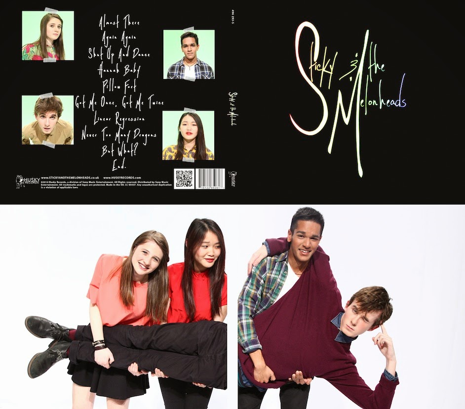
| The rainbow border around the track list matches with the colour scheme of the front cover. The sticky tape also is synergistic with our website and the band's name, Sticky and the Melonheads. It is still minimalistic to match the front cover, but a more colourful option than before, better fitting with our band identity. |
 |
| Having the band members on the back cover is possibly a good idea for a debut album because it establishes what the band look like, giving a face to their music. The sticky tape idea is still used in this version. We decided against it because it didn't match with the black background colour scheme we have used on the front cover and the website. |
 |
| This option has photographs of the band members, too, but smaller and in each corner. The sticky tape idea is used for this version too. |
All of us liked the last option the best. It establishes what the band look like, but their images are smaller than in the second option, so our black background can be maintained consistently and it is more synergistic with the website. It matches the front cover better and provides a more effective contrast with the inside cover.
No comments:
Post a Comment