
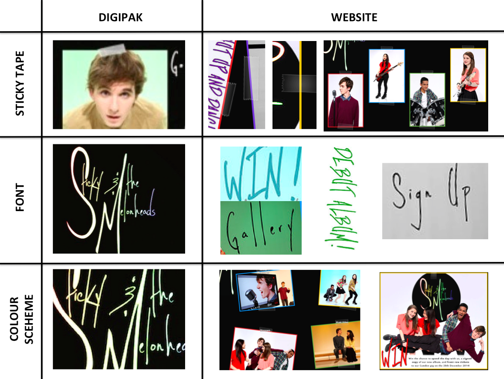
We wanted our two ancilliary texts to work together, too, to effectively brand our artist in ways that a music video can't, e.g. with the font used. The table below briefly illustrates some examples of how our digipak and website work in synergy stylistically:


Richard Dyer makes the point that an artist's identity is not just restricted to their music and The 1975 demonstrate this: the image constructed in their music videos extends into their album cover and website. All these products, music video included, follow the same black-and-white colour scheme to establish The 1975's 'cool', indie-rock image.


Similar to The 1975, the lighting used in our music video matches the colours used for our logo on the album cover, and on the website:
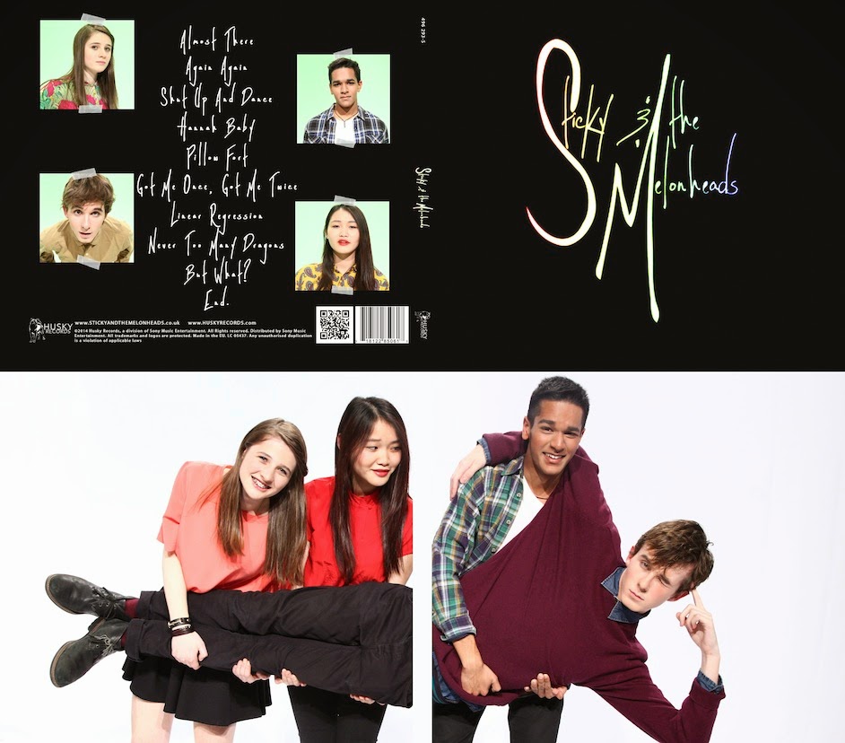
- The sticky tape appears on the back cover of the digipak and frequently on the website. As well as tying these two products together, it links to the name of the band: Sticky and the Melonheads, so this image becomes associated with the band.
- The rainbow colours used for the logo on the album cover match the coloured borders and fonts used consistently on the website. The black backgrounds also match.
- The font of our logo on the album cover is also used on the website for most of the headings and links. Using the same font consistently across platforms is done frequently when promoting an artist:
The 1975 album cover and logo on the website header (pictured below the album cover) use the same fonts
 |
| Ed Sheeran website and albums/EPs below - hand-drawn style used has been repeated across all album art and is used for the font on the website |
The matching colour scheme of black and rainbow colours could mean that our ancilliary texts don't combine with our main text so effectively - the music video consists entirely of light and vibrant colours, which maybe contradicts with the black background used on the website and digipak.
The rainbow colours do extend into our music video, however. This is sometimes done with real campaigns, The 1975 being an example:
The rainbow colours do extend into our music video, however. This is sometimes done with real campaigns, The 1975 being an example:
 |
| The 1975 album cover |
 |
| The 1975 website |
 |
| Stills from the music video for "Chocolate", The 1975's single |
Stills from music videos for "The City" and "Sex"
Richard Dyer makes the point that an artist's identity is not just restricted to their music and The 1975 demonstrate this: the image constructed in their music videos extends into their album cover and website. All these products, music video included, follow the same black-and-white colour scheme to establish The 1975's 'cool', indie-rock image.
Font used on header, captions for pictures and across The 1975's website...
The simple, minimalist font also maintains this 'cool' indie image


Rainbow colours used for logo on digipak and website as well as images across these two products
The coloured lighting helps the audience to differentiate between the set-ups but the colours used across all three products help to construct our artist's image as a lighthearted, upbeat indie pop band.
In addition to creating a brand identity for our artist, our main and ancilliary texts work together to promote each other as well as the artist in general. For example:
 |
| We have a music video page on our website that allows the audience to watch it on the website itself - this is an example of cross-media convergence which is essential to create an effective marketing campaign The music video page on the website could encourage the audience to purchase the band's music. |


 |
| The album is promoted across the website, on the home page, store and navigation bar |
We also created synergy with the band's costumes:
 |
| The photo on the inside over of the digipak shows the band wearing their outfits from the music video |
 |
| These outfits are also used in publicity shots featured on the website |
The characters and personalities of the band members are also consistent across the three texts. In the music video the performance is quite fun and the band don't take themselves too seriously, especially in the era scenes:


They still have moments of appearing more serious and "cool" in their performance:
 |
| Dyer states that an artist's personality is established through songs and performance, and through this they aim for immediate star identity with the first album. This is what we aimed to achieve with our music video. |
Extending this to the ancilliary texts, the front cover of the digipak reflects the band's cooler, more serious nature, while the photograph on the inside cover conveys their more playful, lighthearted identity (see the images above).
Similarly, on the website, a combination of sillier and more serious shots are used:
 |
| Serious shots of the band members used on the about page - posing with their instruments, this presents their identity as musicians |
 |
| Example of a more fun picture - using a fun picture on the competition page is appropriate since this is what would attract major fans of the band, who would be more interested to see every aspect to their identity |
In conclusion our main text and ancilliary texts work together quite well to create an obvious brand image for our artist, but maybe the black background used on the website and digipak is contradictory to this image. Also the most significant aspect of our music video was the eras theme, and that is not referenced at all on the website or digipak. However our three products are more or less consistent stylistically and establish our artist's identity.
No comments:
Post a Comment