
For this shoot we used the costumes from the music video to promote the single and video as well as the album and band more generally, and to establish their band identity.
We took some shots of the band as a group:


We wanted to show them having fun and not taking themselves too seriously, something inspired by our earlier research:


 |
| 5 Seconds of Summer (top left) and San Cisco (bottom and top right) |
This also established our band's identity as a fun, upbeat sort of band, fitting with the indie pop genre, and matching with the style of the track.
We also tried some more serious shots:

We also took individual publicity shots, to establish our band members' individual identities. If the audience get to know the individual members too, the band becomes more personal to them because they feel like they know who they are.


These images show the band members with their instruments, establishing their roles in the band, and confirming to the audience who does what.


Examples of the band members without their instruments - this helps to construct their identities not just in terms of what instrument they play, but their personalities, too, e.g. Brandon as a fun, joker-type character and Chrystal as a more serious, powerful but cool character


We decided to create bio pages on the website for each individual band member, and these are the photos we are using. We wanted to use mid-shots since it allows the audience to see their faces properly, suitable for a page that is designed to help the audience get to know the band.
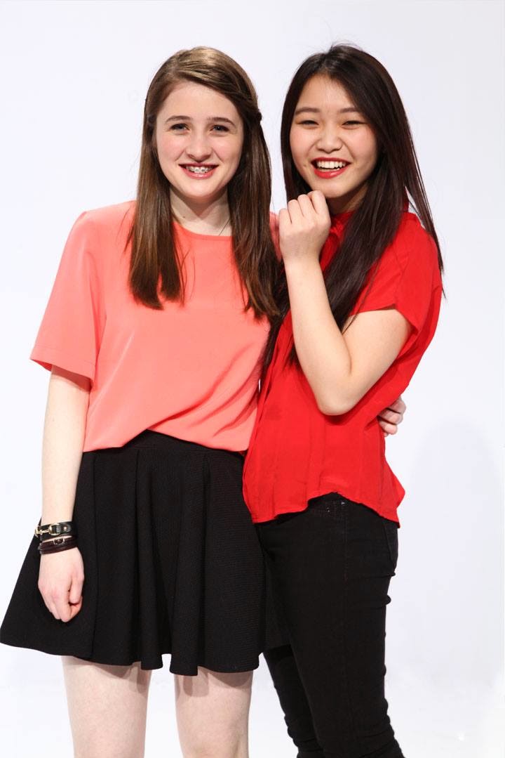

We took some shots of Chrystal and I together to construct the feminine aspect of the band's identity - the picture on the right constructs the representation of powerful female roles, balanced with the picture on the left in which we are just having fun, and creates an impression of the band members being genuinely close, making them seem more personal to the audience.
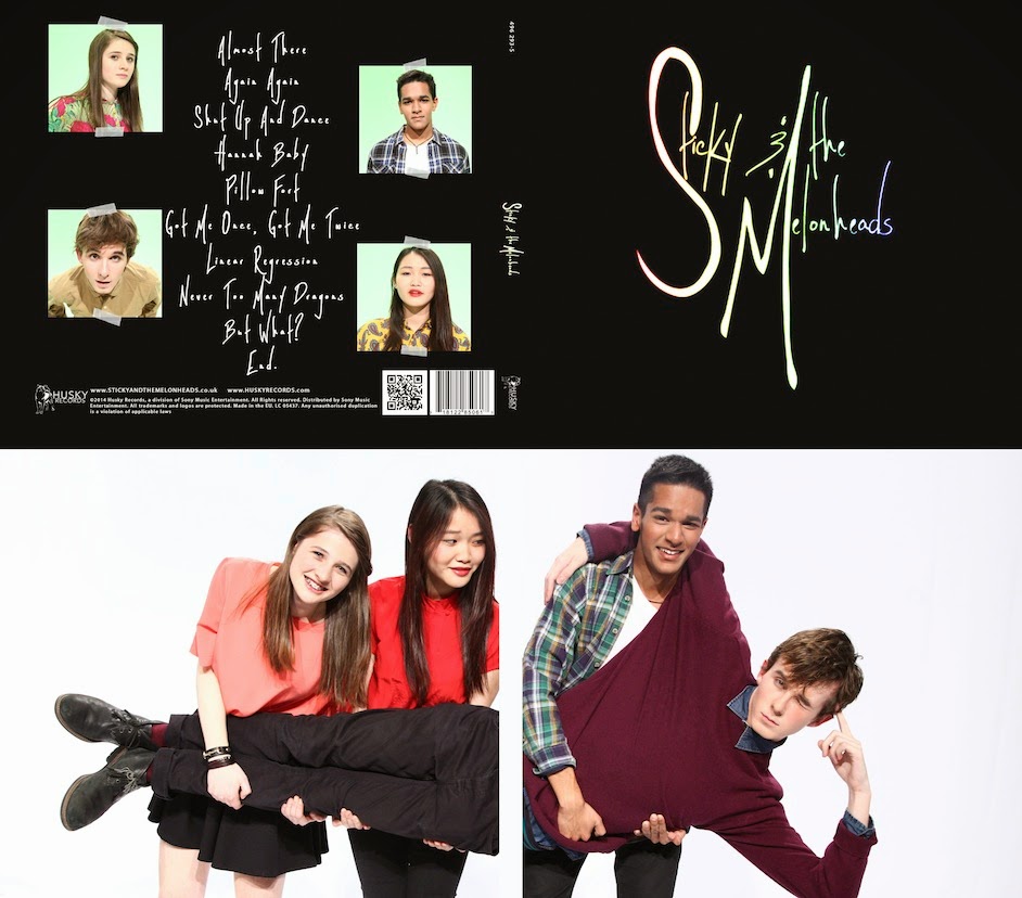
This is the photo we are using for the inside cover of the digipack:

It will cover the entire inside case: behind the CD and behind the front cover. We thought this was a good idea because:
- since the band are carrying Jacob, he is clearly the lead, confirming the individual identities of the band...
- ... but all the band are still shown clearly, so the attention isn't taken away from any of them and their roles aren't invalidated
- they are having fun and messing around, fitting with the upbeat nature of our chosen track (so supposedly with most of the other tracks on the album)
Here are some of the other publicity shots taken that day, which we will put in the gallery on our website:


To ensure the publicity shots looked as professional as possible, we wanted to edit the pictures, which Juliette did since she is the most confident using photoshop.
In this example Juliette edited out the border between the floor and the cyclorama and also the drum kit, and graded the photo to make the colours clearer and more vibrant.
 |
| Before editing |
|
| After editing |
No comments:
Post a Comment