During the research and planning stage of the project I asked some of our audience how they consume music:
Above are examples of both our primary and secondary audiences - indie fans and 16-25 year olds. They both use iTunes and YouTube to consume music which shows that the Internet and digital downloading is a common method of music consumption.
However the second example also shows music consumption using CDs and Vinyl. This demonstrates diverse music consumption habits among this demographic, and could be a reflection of the indie/"hipster" mentality - wanting to consume 'vintage' products and engage in media that diverges from mainstream trends.
From this I created an audience profile for our target audience:
16-25 year-olds are arguably the most significant demographic of this audience since they are at the age where they have developed their own music taste and consume music in a variety of ways, from Vinyl to digital downloading. Older audiences would be less likely to consume music from new, upcoming young artists like our band.
We asked for feedback from our target audience throughout the editing process. This meant our audience could help us make decisions and point out problems with our video, so our final product would hopefully appeal to them more effectively.
The examples of feedback on the left were collected during editing. Since they both recognised the genre and understood the narrative we felt that we had effectively conveyed these in our video.
Both audience members pointed out problems with our editing: "jarring movement in band scene" and "one shot was out of sync". The benefit of asking for feedback during construction meant that we could fix these problems.
Using surveymonkey.com, we conducted a web-based online survey to find out how our audience responded to our video.
 |
| These first two questions gave us an idea of who was responding to our video. The majority being 16-25 was helpful because this is the age we would expect our audience to be. |
We also asked the audience to identify the genre of the song, to see if we had effectively conveyed the indie pop genre.
 |
| Most people thought it was pop or indie, which suggests our artist was clearly indie pop as we had intended. |
Most of the comments criticised the band performance, which highlights this as a possible weakness of our video. The choreography criticism is also the second time our narrative scenes have been pointed out as boring or repetitive, so perhaps we should have made these more interesting and varied.
For the final question we asked the audience if they had any other comments and if they would want to look into the band further:
The majority said that they would want to look into the band further, which suggests that our artist and video can appeal to this audience. Not everyone did, however, but this doesn't mean that our video/artist can't appeal to our target audience. The person who said it isn't their "sort of music" is actually a part of the 11-15 age group:
As we are targeting 16-25 year olds, and primarily fans of the genre, this person is not who we are targeting because they don't belong to either of these audiences.
The others who stated that they would not look into the band further did not say why, so it would have been more helpful if we had asked why this is the case. We also don't know what genres these people typically listen to. Even so, we know from this that our artist does not appeal to everyone in our secondary audience, but this is expected - 16-25 year olds are consumers of a diverse range of genres, and overall the feedback suggests that our artist could have a wide enough reach within this age group.
In addition to our survey, we filmed audience feedback sessions to give us more qualitative data and detailed, personal responses to our website and digipak in addition to our music video. For this we conducted one-to-one interviews with people both within and outside of our target audience.
MUSIC VIDEO FEEDBACK:
The feedback is explained in the chart below (hover the mouse at the bottom and zoom in/zoom out buttons will appear. Or you can double click to zoom in):
DIGIPAK FEEDBACK
WEBSITE FEEDBACK
This feedback is summed up in the presentation below:
The feedback shows a popular element of our digipak was the photograph of the band on the inside cover. This tells us that including images of the band on the digipak is appealing to the audience, which could be because audiences like to get an idea of who they are listening to - they want to see the artist as well as hear them.
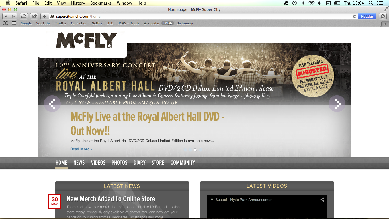
Our banner on our website is also apparently distracting. Looking at existing websites, one example of a website with a moving banner is McFly's:
The difference is that their banner only appears on their homepage:
From this we can learn that it might have been better for us to only show the banner on the home page.
Our banner on our website is also apparently distracting. Looking at existing websites, one example of a website with a moving banner is McFly's:
The difference is that their banner only appears on their homepage:
 |
| News page - no banner |
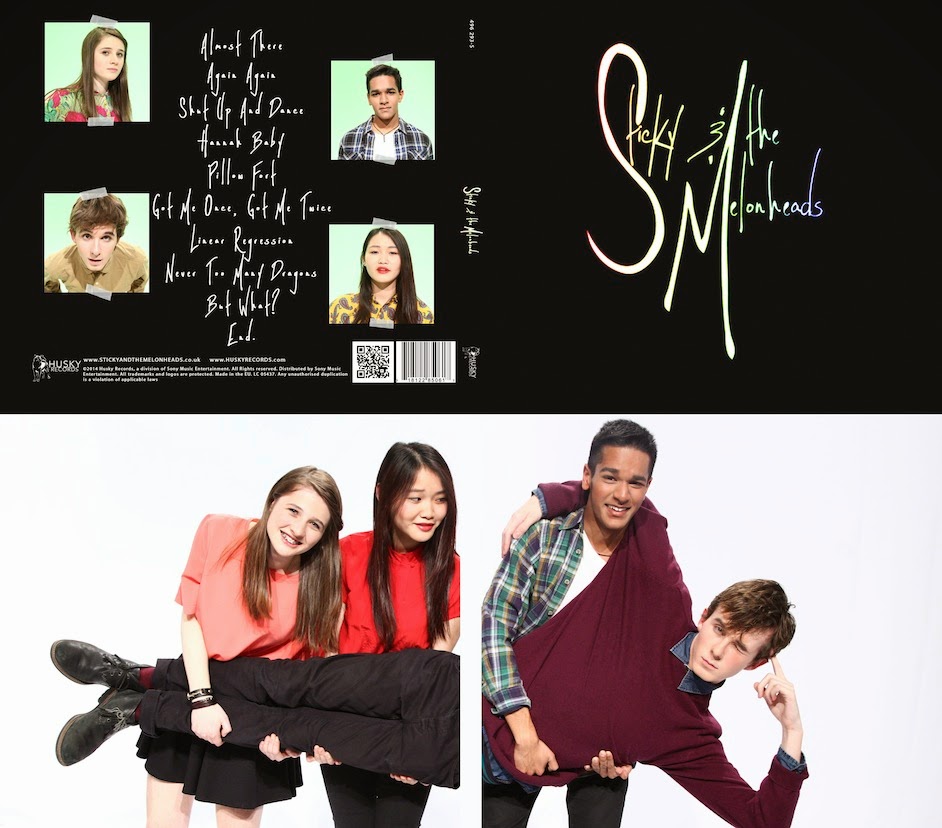
Something else interesting that we learned from this feedback session is that our band have the potential to appeal to older audiences in ways we hadn't predicted: the digipak has a "feel of an old vinyl".
This doesn't necessarily mean that the band's music would appeal to this audience, but aesthetically the digipak can attract them as it looks like how music used to be packaged and so creates a sense of nostalgia.
Our colour scheme was also criticised as not conveying our indie pop genre. A different colour might have been more effective in targeting indie pop fans or attracting attention. The reason we chose black, however, is because we wanted to create a balance between the band's fun, upbeat and more serious aspects - to use only bright colours would seem very pop but not very indie. Maybe to improve we could have made the more serious indie element of their identity more obvious.
Black colour scheme on digipak and website
Overall our feedback suggests that our audience responded positively towards our music video, digipak and website, but there were some things that we could have improved for all three products. It is not entirely useful because we did not ask what genres they listen to, so we don't know if they are a part of our core target audience or not, but judging from the feedback if I could re-do the project I would make the narrative scenes of the video more interesting and varied and maybe reconsider which eras we included to make our theme more obvious to everyone.


No comments:
Post a Comment