Hi, welcome to my media coursework blog. My name is Audrey King Lassman (0397) and I am working in Group 3 with Chrystal Li (0470), Brandon Poonwasie (0660) and Juliette Wileman (0875). You can navigate my blog by clicking on the labels at the right hand side.
Thank you for taking the time to look at my blog!
Here is the link to Group 3's Facebook group, where we discuss and plan things for the project:

Our music video

Our Website

Our Digipak Cover

Our Digipak Cover
Showing posts with label a2 construction. Show all posts

Thursday, 18 December 2014

Music Video - Audience Feedback and Reflections

Here is the final cut of our music video:

Throughout the editing process, we received feedback from members of our core audience of 16-25 year olds. We responded to some of this feedback by adjusting the video slightly, for example:
This person noticed jarring movement in the band performance. We took this on board and re-edited it slightly to fix the problem.

Here is some more audience feedback we received:
Overall this feedback was positive. Two out of four of the above examples correctly stated that the genre is indie pop, and the other two were not completely incorrect, at least recognising the pop and indie aspects of the genre. This suggests that we were successful in conveying our genre in our music video.

I was worried that our theme of eras was not completely obvious, especially with the 80s and 90s, but everyone we asked understood the concept, suggesting we had conveyed it clearly. Our feedback also shows that our audience responded well to the dance sequences and the modern era especially.

The fact that people we asked liked the modern era could be because it is something that they can identify with, since it is the era we live in and have grown up in - the modern era represents our audience. This is good because a significant part of why people enjoy music or an artist is because they identify with it, and we have possibly created something that people can identify with in some way.

Reflecting on the video myself, I am mostly really happy with it. It turned out better than I expected it to. I liked the range of shot types, such as the ECU of Jacob and the close-ups of the guitar and bass, and the way the footage cuts between the different shots quite smoothly. With music videos generally the editing should not be too noticeable - it should look natural so the audience don't really consciously think about the fact that the footage has cut from one shot to another. I think our music video does this quite well.

Shots I particularly liked
The video is not perfect, though, and there are things I would improve if I could do it again, for example:
- When the footage cuts between the 80s and 90s before transitioning into the 90s scene, Jacob is out of character because when filming we had forgotten about the cutting and thought the earlier part of the shot would not be needed. It isn't especially noticeable because it is very fast-paced but it still bothers me slightly.
Between set-ups: Jacob is looking away from the camera
When the 90s scene properly starts: all of a sudden he is engaged and energetic
- I still wonder if we chose the best selection of eras. While I really liked the 80s scene, I don't think it is especially recognisable as the 80s specifically, and even if it is obviously the 80s, I think there are lots more interesting things we could have done with the 60s. We decided against 60s in the first place because aesthetically it is quite similar to the 50s and 70s, but Saturday Night Fever and disco is specifically and obviously 70s and not 60s, and there are 60s references we could have made that would have clearly differentiated it from the 50s - for example, a reference to the early Beatles, something very recognisable to most people. As the eras are introduced chronologically anyway, I think the era would have been quite obvious.

These are not major problems, however, and overall I am still happy with how the video turned out.

Digipak - Design

Following our earlier flat plans, this was our original design for the digipak:

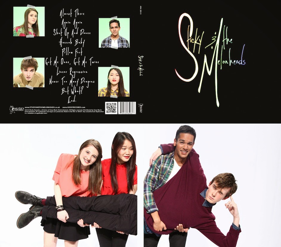
We chose the band logo to simply be the album cover because given that this is Sticky and the Melonheads' debut album, it is important to establish who they are and the band logo keeps that in focus. So that their band identity is also established, a picture of the band is displayed on the inside cover. The photo we chose is a playful one to convey the upbeat, fun nature of their music. 

We also wanted to have a photograph with a white background to provide a contrast from the black front and back cover. To have the inside cover black too would fail to convey the band's lighthearted image.

After reflecting and getting teacher feedback, however, we realised we needed to change our back cover. The track list was in the centre, but aligned to the left. Two influential album back covers, The 1975's and The xx's (pictured below), show that if we want to have a numbered, left-aligned track list, we should position it to the left rather than in the centre:
 The 1975 back cover (left),  The xx back cover (right)

We decided to try centre-aligning our track list and removing the numbers:

Aesthetically, this looked better than before, but we still wondered if our back cover was too plain. The examples from The 1975 and The xx above show that plain, all-black back covers are a convention, but these bands are more indie rock than indie pop and have a different image to our band's more vibrant, playful identity. 

We experimented with different options for how to make the back cover look more interesting and match our band identity:
The rainbow border around the track list matches with the colour scheme of the front cover. The sticky tape also is synergistic with our website and the band's name, Sticky and the Melonheads. It is still minimalistic to match the front cover, but a more colourful option than before, better fitting with our band identity.
Having the band members on the back cover is possibly a good idea for a debut album because it establishes what the band look like, giving a face to their music. The sticky tape idea is still used in this version. We decided against it because it didn't match with the black background colour scheme we have used on the front cover and the website.
This option has photographs of the band members, too, but smaller and in each corner. The sticky tape idea is used for this version too.
All of us liked the last option the best. It establishes what the band look like, but their images are smaller than in the second option, so our black background can be maintained consistently and it is more synergistic with the website. It matches the front cover better and provides a more effective contrast with the inside cover.

Wednesday, 17 December 2014

Editing - Cutting between the eras

In the pre-production stage of the project, we planned that the era scenes would cut between each other quickly, for example: the 50s scene would end, cut to 70s, then back to 50s, then back to 70s etc., all within a couple of seconds and in time to the music as a way of transitioning into the 70s scene.

When we were filming, we had forgotten about this, and originally didn't include it in our edit. Later we realised that our video was looking quite slow-paced and remembered about this idea, which would make it much more interesting to watch.

This is what it looked like:

When getting teacher feedback on our video, another problem was pointed out to us: usually music videos have some sort of climax towards the end of the song, to match with what is often the climax of the song itself, and this could be reflected in the narrative or the pace of the editing, for example. Our second dance sequence did not fit this climactic role because a dance sequence had already happened earlier in the video.

We came up with a solution to this problem: splitting the screen between the different set-ups.

One way that we tried this was splitting the screen in half so it still looks like one shot:

This didn't work because their bodies weren't in the exact same place, so it didn't look natural.

We decided instead to split the screen so that the shots are repeated rather than split across their bodies, and we would only include vertical splits because to mix between horizontal and vertical split-screens might be confusing for the audience.

We tried splitting the screen both in half and into quarters so all the eras are tiled:
I didn't like this because the different shots looked too small when they were tiled and it looked jarring when it cut between four eras and then two eras. 

We decided to only use vertically-split shots of two or three era, also cutting between shots with only one era. This is our final second dance sequence:

This cut is better than the earlier versions because it is now an effective climax and still cuts between the eras smoothly, but in a more interesting way, without looking strange or confusing the audience. Also, it links all the different parts of the video together, so they all become part of the same story.

Editing - Colour grading

Grading our shots was an essential part of the editing process, to give the footage a greater vibrancy and more contrasting but natural look. For most of this, we used ProcAmp and Three-Way Colour Corrector, features of Premier Pro that we had all previously had experience with:

These were used for every shot, but for some we also used Change Colour if we needed to. The guitar close-up is an example of when this was used:

Grading was particularly important for this shot to improve the contrast between the black and white of the guitar, improving it aesthetically, and making my skin less yellow (the colour wheels on Three-Way Colour Corrector were also useful for making our skin tones look more natural, as they often appeared too yellow in the footage). As the first shot of the video, it was especially important that the colouring stood out.

I had never used Change Colour before and Juliette was much more confident with this, so she was mostly responsible, but we all had input on what the shots looked like and what needed to be done.

Possibly the most challenging part of the video to grade was the 80s footage, because we had filmed the same scene on two separate days and so there was a colour difference between two takes. To fix this we had to use Adobe After Effects. I didn't know how to use this software, so most of this was done by Juliette, but again we all had input on how it actually turned out.
Grading the 80s

Monday, 15 December 2014

Editing/Website - Blooper reel

Alongside editing the video, we made a blooper reel with outtakes, and footage of the band and Juliette having fun. This gives the audience a way to feel involved with the band - they get to see them just acting normal rather than working to fit their band image, so they seem more genuine and more personal with their fanbase.
Blooper reel

It is also something for the audience to laugh at, too, and contributes to our band's lighthearted image and the idea that they don't take themselves too seriously all the time.

Fans can access the blooper reel via the gallery page our website:
Gallery
Link to blooper reel - an image of the band goofing off to fit with this

Website - Improving interactivity

It was important to make sure that our website was interactive as well as informative so the audience can get the most out of it. This includes how the audience can interact with the website itself, and how they can interact with the band.

We made an interactive banner to put at the top of every page. The banner is a slideshow of these different images, and when you click on it, it takes you to a certain page on the website:
Takes you to the Music Video page
Takes you to the Competition page
Takes you to the Store
Takes you to the Tour page
We kept the same font on all of them - the font that we are using for our album cover and other parts of the website - to keep our brand image consistent. We wanted to have a banner because it means the audience are attracted to different parts of the site and so are encouraged to engage more with the artist in some way, e.g. by clicking to the store page because of the advert for the album, which could lead to them buying merchandise. As well as increasing interactivity, it increases opportunities for purchasing.

We put a navigational bar at the top of every page on the website:

This allows the audience to quickly access any part of the website that they are looking for. The Home button links the user back to the home page, but when testing the website I found myself automatically clicking the logo in the top left hand corner assuming it would take me to the home page:
We decided to add this feature and make the logo a link to the home page too, while keeping the Home button on the navigation bar in case the user doesn't realise that the logo is a link.

Another change that we made was on the store page. Originally, all the items were pictured without any text - the audience could see the price and name of the item by clicking on it. We decided to change this so the audience can see the prices straight away:

This increases the ease of using the website because the information is immediately visible.

To increase opportunities for interaction between the audience and the band themselves, we created social media accounts: an Instagram, Twitter and Facebook page:
Our Facebook page 
Our Twitter page 
Our Instagram page
This is because our audience largely consists of 13-25 year olds, who are generally avid social media users, and even outside of this age group, social media accounts are arguably the most effective way that an artist can promote themselves: promotion can be instant, it is quick and easy, interactive as the artist can directly communicate with fans, and is wide-reaching as it is something almost everyone has access to. Someone would have to decide to visit Sticky & The Melonheads' website, but they wouldn't necessarily decide to see a Sticky & The Melonheads tweet on their Twitter feed, for example. This means the band can be promoted even to people who aren't seeking information about them.

Our social media accounts are linked at the bottom of every page:

We also included an iTunes link so the audience are given an opportunity to download our music.

Another way that we improved interactivity between the band and the audience was by creating a competition that fans can take part in. The competition has its own page on our website, the link displayed on our navigation bar:

The competition can easily be entered simply using social media, which allows anyone to take part for no money, so fans who don't want to spend money won't be excluded from it. It gives fans the opportunity to meet and spend time with the band in person, which would be very appealing to some fans and it also creates the impression that the band want to interact with their fans personally and that they care about them. 

Often being a fan of an artist feels like a one-sided relationship, but competitions like this create a sense of that audience-artist relationship being two-sided. Another way that we tried to do this was by creating a sign up page on the website:

The sign-up creates an opportunity for further consistent promotion to the audience, but it is the option to send the band a message that would really appeal to fans. As with the competition prize, it suggests to the audience that the band genuinely care about their fans, and it provides the audience with a way to interact with them personally.

Website - Institutional information

Alongside links to the band's social media accounts and an iTunes link, we displayed links to institutional information at the bottom of every page on the website. This includes a link to the record label's website (plus their logo), Privacy Policy, Terms & Conditions and a contact page:

We looked at the Privacy Policy and Terms & Conditions pages on existing artists' websites to see what we should include:
Privacy Policy on One Direction's website 
Terms & Conditions on Nina Nesbitt's website
What we found is that these are not specific to the artist - they are relevant to the record label that the artist is signed to. As an independent label, Husky Records might not have their own Privacy Policy or Terms & Conditions but since they are subsidiary label of Sony Music Entertainment, we used the information relevant to that major umbrella label, and displayed the Sony Music logo at the top as shown on the examples above:
Privacy Policy 
Terms & Conditions
We also provided a contact page for the audience to contact Husky Records or the band - the record label's address and phone number is provided, and so is an email address specific to Sticky & the Melonheads. This information is designed more for bookings or enquiries rather than fan interaction. We also included a map with the Husky Records office that the user can interact with.

Website - Tour dates

Playing live is part of the whole point of being a musician, and a tour is a key part of promoting an artist's music. It is also something that appeals to fans of a band who would love to see them live, or just music fans who enjoy gigs in general.

An artist's website is where people go to get information about them, and tour dates are a part of that information. Therefore it was essential to create a tour page on our website:
A "Tour" button is on our navigation bar so it can be found quickly
On the tour page there is also a photo of the band to make it more aesthetically attractive 
Tour dates 
Our venues were chosen based on the band's indie status and the fact that they are a debut artist. They couldn't sell out especially large venues or arenas, but places like the Roundhouse are Camden are more realistic. The "What's On" page on the Roundhouse website illustrates this:
Artists playing this venue include:
- Indie rock/folk band Kodaline
- Indie rock band Interpol
- Alternative singer-songwriter Ana Silvera
The examples above are all lesser-known artists, many of them of the indie genre like Sticky and the Melonheads, showing that this would be an appropriate venue for them to play. The same goes for the other venues on the tour.

Website - News page

To provide information about the artist and events they are doing, we created a news page with links to further information:

The news provided includes events such as a signing, interviews and TV appearances, and information about their music. As well as informing the audience, this promotes the band further. It also keeps fans up to date about what the band are doing.

Website - About page and band profiles

On our website we decided we wanted an About page, with information about the band - such as how and when they were formed - with links to profile pages for each individual band member.

We had to create names for the band members, too, and decided that Jacob would be Eli Minate, Chrystal would be Lumi Lee-Patrick, I would be Geo Coleman and Brandon would be Brendan Smith. Names like "Lumi" and "Geo" are more interesting and unique than most names so would be more memorable, but surnames like "Lee-Patrick" provide a contrast and make them seem less strange.
Our about page has photos of each band member with their instruments to focus the fact that they make music
The text below explains how and when they were formed, who the members are, and when they signed their record deal - kept brief and to the point because the audience won't read masses of text and want to get information quickly
The individual pages for each band member allow the audience to learn more about them personally. Rather than just listing information, each page has a question-and-answer with the band member's response. We did serious questions like "What do you hope to achieve in the band's future?" (Jacob/Eli's page) so the audience can actually learn about the band's career, and sillier questions such as "If you could have any superpower, which one would you pick?" (Chrystal/Lumi's page) to show that they don't take themselves too seriously and to give the website/band a more lighthearted feel.

These kinds of questions, and the fact that the band members themselves have responded personally, helps to establish a relationship between the artist(s) and the audience. The band members seem more real, so the fans can better connect with them - they feel like they get to know them personally, so being a fan becomes about more than just the music but the artists themselves.
Photograph - his pose constructs his identity as cute/innocent lead
Photograph constructs her identity as cool/fierce bassist
Photograph constructs my identity as fun/slightly girly guitarist
Photograph constructs his identity as fun, joking character
We wanted to create an "About" page because it is a common feature of artist's websites, for example, San Cisco's:

San Cisco: on their menu they have an "About" page link
They provide less information about themselves than we do, but we wanted to give more information so audiences can get to know the band
On the music video page, we also provided a profile for Juliette as the actor in our music video:

We had to name Juliette's character, too, and called her Jess. We wanted to give her a question and answer profile because she plays a prominent role in the music video (as well as in our blooper reel) so it is likely that fans would want to know more about her as well as the band. The questions are less silly than a lot of the questions the band are asked, because this is the band's website so the audience are more likely to care about what it is like to work with them rather than what kind of superpower Jess would want to have, for example.