Hi, welcome to my media coursework blog. My name is Audrey King Lassman (0397) and I am working in Group 3 with Chrystal Li (0470), Brandon Poonwasie (0660) and Juliette Wileman (0875). You can navigate my blog by clicking on the labels at the right hand side.
Thank you for taking the time to look at my blog!
Here is the link to Group 3's Facebook group, where we discuss and plan things for the project:

Our music video

Our Website

Our Digipak Cover

Our Digipak Cover
Showing posts with label a2 research and planning. Show all posts

Monday, 1 December 2014

Band rehearsal (7th November)

Before the shoot on November 7th, we decided to rehearse band performance, because there were problems with our footage from the November 4th shoot:
- unconvincing performance - we didn't look like we were really playing our instruments
- self-conscious performance - we needed to improve our confidence and look more natural and relaxed when playing

Brandon can play the guitar so he researched the tabs for our track's guitar and bass parts, and helped Chrystal and I learn it. Because no one will be able to hear what we actually play, it doesn't have to be exactly the same, but it needs to at least look realistic, with our finger positions and strumming patterns looking like they fit with the track.

Brandon teaching Chrystal and I the guitar/bass parts
Brandon also practiced on the drums
This was definitely useful because after practicing I don't have to think as hard about what I'm actually playing, and can focus on performance.

Friday, 21 November 2014

Choreography and performance rehearsals

This video shows our choreography for the 50s, 70s, 80s and 90s set ups:

These were inspired by films and television representing those eras. Here are some examples of dances we incorporated into our choreography:

50s - Grease
Danny falls to Sandy's feet (Sandy later goes to kick him away)
Danny follows Sandy, then she turns around and they walk back the other direction
70s - Saturday Night Fever

80s - The Breakfast Club

We are going to have two dance sequences in our music video. This is the choreography for the first dance (Brandon is standing in place of Jacob and Juliette is performing her own part):


We knew that we would film this dance in the set-ups of all the different eras and edit them together. We tested this out in the studio, using the lighting set-ups of each era and roughly editing it together to see if this could work (here Chrystal is standing in as Jacob):

The choreography is inspired by dances from our chosen eras, for example:

RUNNING MAN - 90s
(The Fresh Prince of Bel Air)


50s
(Grease)


Here is the second dance, which also includes the set up from the modern era: 

This dance sequence is more random and fun than the previous one, because it is towards the end of the video and often in music videos nearer the end is a sort of climax and that's what this dance sequence is for us. 

For the modern scene itself, this is the choreography:

We wanted the couple to be on their phones because as with the other eras, it is playfully referencing the stereotypes of that era. Today there is the idea that technology has taken over our lives and everyone is obsessed with their mobile phones, so that's something we can make fun of here. It establishes the era in an obvious way because it is something the audience are likely to recognise as representing culture today. 

When the characters throw the phones over their shoulders, as well as being fun and slightly humorous, it creates the idea of the couple's love overpowering the thing that has supposedly taken over our lives in this day and age. After this scene it then goes into the second dance sequence, tying all the eras together at the end and giving a message of love transcending history.

Shoot-boards/schedule

Although the storyboard shows the structure of the video, so we know the order of the shots as they will appear, it doesn't provide us with enough detail to effectively organise our shoot days. This is why, for each shoot day, we had to make a shoot-board/schedule so we know exactly what we are filming and when. This is to help us with time management when filming, so we know exactly how much time we have for setting up, doing make-up and filming each shot, and to make sure we get everything done and don't forget about any shots. 

Here is an example of a shoot-board:


This shoot-board is from Tues 4/11, our first shoot day

The shoot-board includes a description of what each shot is - the shot type (e.g. CU [close-up], ML [mid-long]) and what happens (e.g."pushing cup down" - the girl pushing down the lead's cup as he goes to drink it). Since these descriptions are quite vague we include an image of the shot from our storyboard, so we can visualise exactly what we aim to do. 

The set is also included, and props, so we know what is needed and can set up quickly. The cast and lighting are also mentioned, the time that we plan to film it and the time code (TC) so we know what part of the track we are filming for.

Call Sheets

We made a call sheet for each individual shoot. An example is here:


The call sheet gives information about the location of our shoot, contact numbers of everyone involved (cast, crew, runners), health and safety information and a brief schedule of what we are shooting and when. Props and costumes needed are also listed. The call sheets are useful because having an overview of the essential information for our shoot ensures effective organisation - we know what we need to bring, where we need to be and when.

When we knew what time we had available in the studio, we worked out what set-up we would shoot and when, and how long we would need for filming, make-up and setting up.

Thursday, 20 November 2014

Schedule of studio shoots

Here is the schedule we were given showing when the studio is available to us and when we are able to shoot there:


As Group 3, all the purple boxes show when we are set to film there. This shows we will have six shoot days in total:
- Tuesday 4th November
- Friday 7th November
- Wednesday 12th November
- Saturday 15th November
- Tuesday 18th November 
- Friday 21st November

Saturday the 29th of November will also be available for us but we are saving this day for pick ups. 

From this we were able to decide specifically the timings of our shoots and we could go on to organise our call sheets and shoot boards.

Kit List

Here is our final agreed kit list for the production:

CAMERA: Canon 5D Mark II DSLR
LENS: 24mm - 105mm Canon L Lens
TRIPOD: Ball head tripod (Manfrotto 546B with 504HD) + Dolly tripod
LIGHTING: Leapfrog lighting desk + Arri 1000K lights in studio lighting rig, colour filters
PLAYBACK: 50 inch visual playback monitor, 15 inch Macbook Pro + studio sound system 
STUDIO: White floor 

Wednesday, 19 November 2014

Props and set design

50s:
Our 50s set will be comprised of a colourful cardboard cut-out jukebox and two cut-outs of 50s-era cars, a red one and a blue one (only the red one is shown below):


We chose these props because since they are only cut-outs they aren't too expensive, and they contribute to an intentionally home-made feel to the video, creating an innocence that fits well with indie pop and our band's image.

In addition they are easily recognisable features of the 1950s:
Collection of 1950s photographs with jukeboxes
Elvis Presley with a jukebox, 1957
Jukebox advert

Photographs of cars in the 1950s - our cut-outs look very similar to these
We are going to position the jukebox in the centre of our set, and some of the choreography will be centred around it. Each car will be on either side of the set in the background.

70s:
For our 70s set we are going to have a disco floor and a disco ball. The disco ball we bought online, but the disco floor we had to make using coloured sugar paper:
Making the disco floor
The 70s set was inspired by our main influence for this era in our video: 70s disco, in particular the film Saturday Night Fever:

Since disco is one of the most recognisable aspects of the 70s, it seemed like an obvious choice for our set, also because it is easily distinguishable from our other eras.

80s:
Our 80s set is quite minimal, because unlike for 50s and 70s there are no especially iconic set designs representing the era that we could have chosen. We based our set design instead on The Breakfast Club, using a bench like the one two characters famously shuffle across in the 80s film:
(the bench itself is not really visible here, but ours will be)
We are using a bench from the gym in the school. 

Another prop for this scene is a book that Juliette's character will be reading, when sitting on the edge of the bench.

90s:
For the 90s set we are going to have a sofa that the characters sit on. This is inspired by our main influence for this era, Friends, and the iconic Central Perk location:

We will also have a coffee table and a mug with the Central Perk logo on it, which Juliette already has and so is able to provide. The reason we are deciding on this is because Friends is a widely recognised part of 90s popular culture, so our audience will be more likely to understand what we are referencing and what era it therefore is. 

Since it will be difficult to bring in an actual sofa we will make one that looks like a real sofa using chairs, cloth and cushions.

To make sure that our set references the 90s as a whole rather than specifically Friends, we are also going to include a boom box, positioned next to the sofa (which will be in the centre of the set). 

Modern:
Our modern set will consist of a zebra crossing, and mobile phones will be used as props. We wanted to include technology in our modern scenes because that is arguably what is most distinguishable about this era, and there is the stereotype that people today (especially teenagers and young adults, our target demographic and the age of the performers) are obsessed with their phones and always using them. The era will therefore be obviously identifiable.

The phones will be literally thrown onto the floor by the performers in this scene, so we are going to use old broken phones that some of us have so it won't matter if they break
The zebra crossing allows for space to focus on the choreography and the performers. There are no specific sets that easily connote the modern era so with an everyday, simple set up like a zebra crossing that our audience will recognise from their everyday lives, they will then be able to identify with this scene. The zebra crossing will be made from black and white paper.

Band:
The set up for the band scenes will be simple: the drums in the back, the guitarist and bassist on either side (with their instruments), and the singer's microphone in the centre (but a little to the side of the drums so Brandon won't be obscured by Jacob).

We will also have an amp behind the guitarist and an amp behind the bassist. We don't want to use ones that are too small so as not to be easily seen or provide an effective background but we also don't want them to be too big to distract from the band members themselves and their instruments. 

The set up of the band is inspired by bands in other music videos, for example, San Cisco in "Awkward":


Here is the bass (left) and guitar (right) we decided on using:


We liked the black and white guitar because the neutral colours match with the white background and also match with the colours I'm wearing, providing a contrast between the black and white of the guitar and the pink colour of my outfit.

I offered this bass to be used as well:


The other bass (provided by Juliette) we decided was better. It is more interesting than the plain black bass, so our band looks more easily identifiable and unique as well. 

We are going to use a microphone like the one in San Cisco's music video for "Fred Astaire":

This gives our music video a more 'indie' look and also looks more original and interesting than a normal microphone, so it is likely to be more memorable.

Sunday, 9 November 2014

Lighting

In a production meeting we went to the studio and were shown how to work the lighting so we would know how to do it on our shoots:

Learning how to position the lights where we wanted

There are different parts of the light to hook the pole onto that control panning, tilting and spot/fill. This wasn't too difficult to learn how to do.

We also learned how to control the lights from the lighting desk:
Lighting desk
Buttons on the control panel
Brandon at the lighting desk (left), Chrystal and I at the lighting desk (right)

This was more complicated than controlling the lights from below with the pole. There was a screen that had a list of our different lighting set-ups we could click on, but I couldn't work out how to actually set up the lights using the control panel. To me it just looked like lots of random buttons, even after it was explained.

The lighting induction was very useful, though, not only in teaching us how to work the lights but enabling us to test out different lighting set-ups and decide what we wanted for each set up in our video:

50s: red - associated with this era because of typically worn red lipstick...


...and further emphasised by colours used in Grease, such as Greased Lightning, the red car:


70s: purple - associated with disco and Saturday Night Fever

80s: yellow - bright, happy colour to contrast with the darker colour of the previous era (70s), and to give our set more life and vibrancy since props here are limited (a bench)

90s: green - reference to Friends - Central Perk logo, which is directly referenced with props (Central Perk mug) 
Modern: light blue - somewhat neutral colour creates sense of normality and also has connotations of technology, which we are referencing in our video to illustrate our current society

BAND: white - a neutral colour to contrast with the era shots and create the sense that this is the default set up, and the only part of the video that isn't fiction - the real band performing in the real world, whereas the colours are the story

This is also a common convention of performance in music videos:


"Girls" - The 1975
"Shake It Off" - Taylor Swift

Costume

50s 
Our 50s outfit for the lead singer is inspired by the 50s "greaser" image:


Our main reference for this was the character Danny Zuko from the musical Grease:


We decided his costume would be skinny black jeans, black shoes, a tight white T-shirt and black leather jacket.

For Juliette's 50s outfit, we didn't want to reference Grease so specifically to make sure we reference the era as a whole, so we researched general fashion of the 1950s:


Inspired by our research we decided Juliette will wear the dress shown below with the yellow cardigan, because the dress on its own didn't convey 50s as obviously as with the cardigan, which helped create a '50s housewife' sort of look:


70s 
We were inspired by the glam rock style of this era, represented in the 1998 film "Velvet Goldmine" set during the early '70s:


Influenced especially by the picture directly above we decided on Jacob's costume shown in the picture below:

To represent more than just one aspect of the era, Juliette will be dressed in a look inspired by the hippie style of the decade. We found that "hippie" dresses were often decorated with geometric and floral patterns:


 Juliette's 70s costume is inspired by this:


80s
Jacob's costume for the 80s was inspired by 80s pop singer one of Rick Astley's outfits in the music video for "Never Gonna Give You Up":


This is a blue denim shirt tucked into blue jeans with a belt. We decided on this firstly because it is quite easy to source so it won't be too difficult or expensive and secondly because it looks representative of what people would've typically worn in that era.

Jacob's 80s costume
Juliette's costume is inspired by the character of Allison Reynolds from The Breakfast Club:


We recreated the baggy clothes, long skirt and converse for Juliette's look. We thought this aspect of 80s fashion was best for our video because, as with Jacob's outfit, it is easy to source yet still representative of the era.
Juliette's 80s costume
90s
Our main influence for our 90s costumes is the 90s sitcom Friends, because since it is so popular even today, it means that it will be recognisable for our audience, so they are more likely to understand which era we are referencing.

For Juliette's outfit we took inspiration from the character Rachel and the dungarees she wears:


As well as being easy to source, it provides a contrast with the other eras as Juliette wears a skirt for all of them, and looks more typically 'feminine' - this costume choice allows for a wider range of fashions to be represented, giving different people within our audience something to identify with. We also thought this is fairly obviously identifiable as 90s fashion - dungarees are worn in Clueless and 90s Nickelodeon sitcom Clarissa Explains It All (shown below), for example, and are generally recognised as belonging to that era.

 Clueless (left), Clarissa Explains It All (right)


Juliette's 90s costume

When researching men's fashion in the 90s, we found the shirt over T-shirt look was common:
Joey from Friends

Cory from Boy Meets World (90s sitcom)

Joey from Full House (90s sitcom)
Inspired by this we decided Jacob will wear a loose white T-shirt, baggy jeans and a checkered shirt over the T-shirt:
Jacob's 90s costume
Modern
For the modern era Juliette is wearing a grey top and mostly black-and-white patterned skirt. We like this outfit because the neutral colours provide a contrast to the more vibrant, colourful and over-the-top outfits from most of the other eras, and it looks quite feminine, contrasting effectively with the more tomboyish dungarees from the previous era. Also it looks obviously modern and like something someone today could wear, without looking too typical or boring for a music video - she still looks like she is styled and dressed nicely.

We also wanted Jacob to look styled but still wearing ordinary modern clothes, and we decided to keep his outfit similar but not exactly the same to his band clothing to link the two aspects of the video. We decided on a button-up beige shirt and black skinny jeans.

Jacob and Juliette's modern costumes
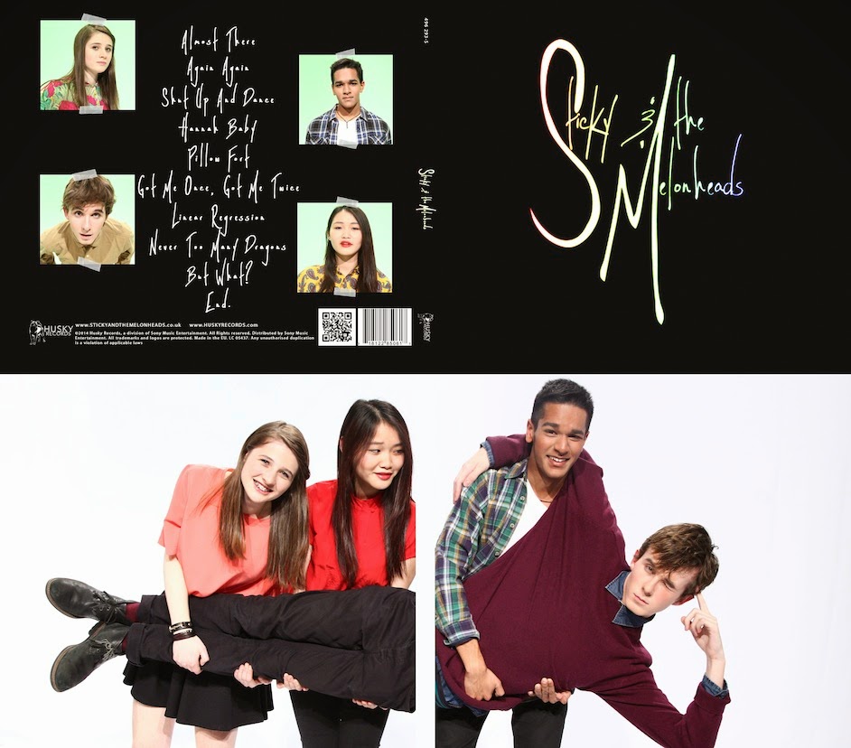
Band
On Pinterest we collected images that inspired the band image we want to present with our costumes:
Band image Pinterest page
When researching we found button-up (often checkered) shirts to be a common convention of the indie genre. The bands and artists pictured below all have at least two band members demonstrating this:
Indie pop band Walk the Moon
Indie pop band San Cisco
Indie singer-songwriter Lewis Watson
Indie rock band Alt-j
Indie pop/rock singer-songwriter Nina Nesbitt
Inspired by this, here is Jacob's outfit for the band:

We chose a blue denim shirt buttoned to the top, a purple jumper and black skinny jeans. The jumper gives him a more fun and innocent look because of the colour, conveying the indie pop genre specifically. Black skinny jeans are also commonly worn by indie (especially male) artists.

These were some of Brandon's suggestions for his outfit:

We liked the checkered shirt look and chose the green shirt on the right. He will also wear black skinny jeans and black boots, matching with Jacob's outfit to give our band as a whole a clear image, but he is also going to wear a white T-shirt under the unbuttoned checkered shirt. This ensures our band members won't all look exactly the same, and gives Brandon and Jacob their own individual styles and characters. 

Chrystal initially suggested this shirt for her outfit:

Similarly, these were my initial suggestions for my outfit:

We decided against these because firstly, what Chrystal and I suggested were too similar to each other, and also to the other band members. We thought our band would have a more diverse and fun look and a wider appeal if the female band members were dressed slightly differently.

We decided that Chrystal will wear a red top, black skinny jeans and black shoes, the red colour emphasising a powerful feminine quality without the outfit being too 'girly':

Chrystal's costume
To contrast with Chrystal's jeans, we decided I will wear a skirt, but still a black skirt to match, trainers and a pink top, creating a more feminine and fun look for my character than Chrystal's so our individual personalities will be evident stylistically and so more girls within our audience will have someone to relate to:

My costume (minus the shoes)