


Learning how to position the lights where we wanted
There are different parts of the light to hook the pole onto that control panning, tilting and spot/fill. This wasn't too difficult to learn how to do.
We also learned how to control the lights from the lighting desk:
 |
| Lighting desk |
 |
| Buttons on the control panel |


Brandon at the lighting desk (left), Chrystal and I at the lighting desk (right)
This was more complicated than controlling the lights from below with the pole. There was a screen that had a list of our different lighting set-ups we could click on, but I couldn't work out how to actually set up the lights using the control panel. To me it just looked like lots of random buttons, even after it was explained.
The lighting induction was very useful, though, not only in teaching us how to work the lights but enabling us to test out different lighting set-ups and decide what we wanted for each set up in our video:
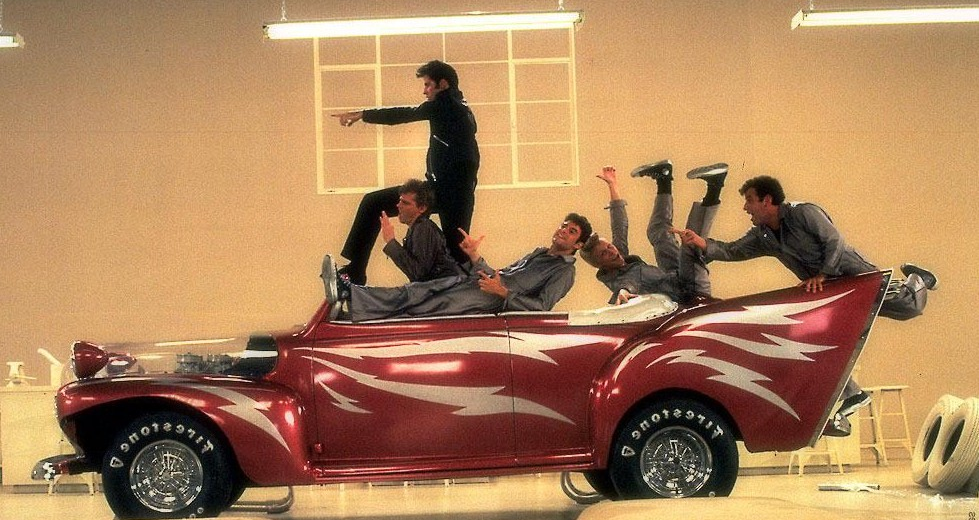
50s: red - associated with this era because of typically worn red lipstick...


...and further emphasised by colours used in Grease, such as Greased Lightning, the red car:
70s: purple - associated with disco and Saturday Night Fever
80s: yellow - bright, happy colour to contrast with the darker colour of the previous era (70s), and to give our set more life and vibrancy since props here are limited (a bench)
90s: green - reference to Friends - Central Perk logo, which is directly referenced with props (Central Perk mug)

Modern: light blue - somewhat neutral colour creates sense of normality and also has connotations of technology, which we are referencing in our video to illustrate our current society
BAND: white - a neutral colour to contrast with the era shots and create the sense that this is the default set up, and the only part of the video that isn't fiction - the real band performing in the real world, whereas the colours are the story
This is also a common convention of performance in music videos:
 |
| "Girls" - The 1975 |
 |
| "Shake It Off" - Taylor Swift |
No comments:
Post a Comment