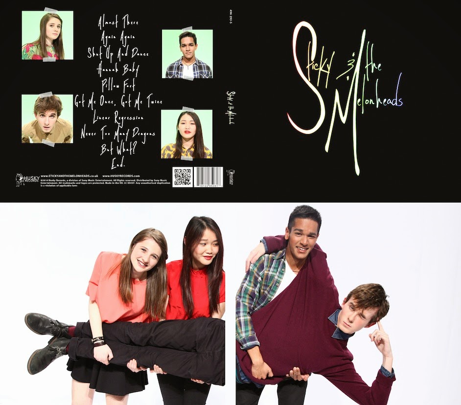
During the same production meeting in which we shared our initial plans for the album cover, we brought in some rough plans for the website design, too:
 |
| Brandon's design |
 |
| Juliette's designs |
We agreed that we wanted our website to have a landing page, as shown in the design above, which you will then have to click to be directed to the main site. We want our logo/album cover to be the only thing on this page. This directs immediate attention to the album, which we thought would be a good idea since one of the most essential functions of a website is to promote the band and their products, mainly their music. This is something artists often have on their websites, as shown by these examples:
 |
| (While more than just the album cover on its own are shown on the Ed Sheeran and Nina Nesbitt websites, it is still solely the albums that are promoted and emphasised on this first page) |
We then made decisions about what the site will look like once you click to enter it. We want a header with a photo of the band, so the image of the band themselves as well as their music is shown. This is a good idea because people come to an artist's website often to find out more about the actual artist and to get a better idea of them, which extends beyond the music and includes what the band look like.
For the actual content of the website, such as photos, videos, information about the band, tour dates, merchandise, etc., we want to display this in boxes like a collage, as done on these websites:
 |
| The 1975 |
 |
| Everything Everything |
Our boxes won't just be images, though - we also want some boxes to be links to more information, marked clearly with text, e.g. "BIOGRAPHY", "MERCH", "NEWS", etc., like on this sketched plan:
This ensures that our website is easy to navigate, which is important because it makes it a more enjoyable experience for fans. Also, people hoping to find out more information about the artist will be more likely to stay on the site for longer, and it makes it easier for people searching for something specific, e.g. information about tour dates - if they can find this easily, they are more likely to make a purchase, which is another important function of an artist's website.
Having a merchandise page is also very important because this is something almost every artist has:

|
| Indie rock/pop band The 1975's merchandise (link labelled "STORE" on their banner) |
 |
| Indie rock band Kodaline's merchandise (link labelled "MERCH" on their banner) |
As well as giving fans a way to become more involved with the artist, merchandise creates more opportunities for making profit, too, which is a key purpose of a website.
What the examples of websites on this post also all have in common is a consistent brand image. Their colour scheme and fonts used remain consistent throughout, and this solidifies the artist's image in the audience's mind, an image which is constructed synergistically, usually repeated on album covers, posters and merchandise. This is what we plan to do with our website and album cover too.


No comments:
Post a Comment