

Brandon and Juliette drew flat plans for the entire digipak, including inside and back covers:
 |
| Brandon's flat plan |

 |
| Juliette's flat plans |
This was the idea for the front cover that we liked the best:

We thought that not using an image of the band was fitting for our genre, because it is typical of indie bands to be presented as focusing on the music over their image (which then becomes their image), and just having the band name on the cover conveys this. It also works well for a debut album, which this is, because it keeps the band's name in focus, so people remember it.
This is demonstrated by the album covers for The 1975 and Franz Ferdinand:


We had a clearer idea of what our album cover design might look like, exactly, with these font suggestions:

We chose the font in the top left-hand corner, called "little sparrow", because it is fun, unique and memorable, which is good for what will be both our album design and band logo.
After making this decision, Juliette made different designs on photoshop to test which colour combination looked best:


We looked at them in our next production meeting and decided we liked this neon rainbow design the best. The rainbow colours best suited our genre, signifying indie pop specifically (rather than indie rock, which some of the other designs seemed to suggest) and matching our band's fun, upbeat track. The black background also keeps the image within the indie genre, so it isn't overly pop or mainstream-looking.
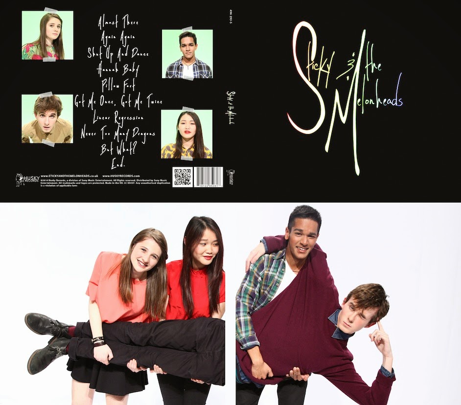
We also decided we want to have the tracklist on the back cover of the album, without any other imagery, like The 1975's back cover:
 |
| (photograph) |
…and The xx's:

This matches the minimalistic feel of the front cover, but as a contrast, the inside sleeve will be more visual, with photographs of the band.
No comments:
Post a Comment